

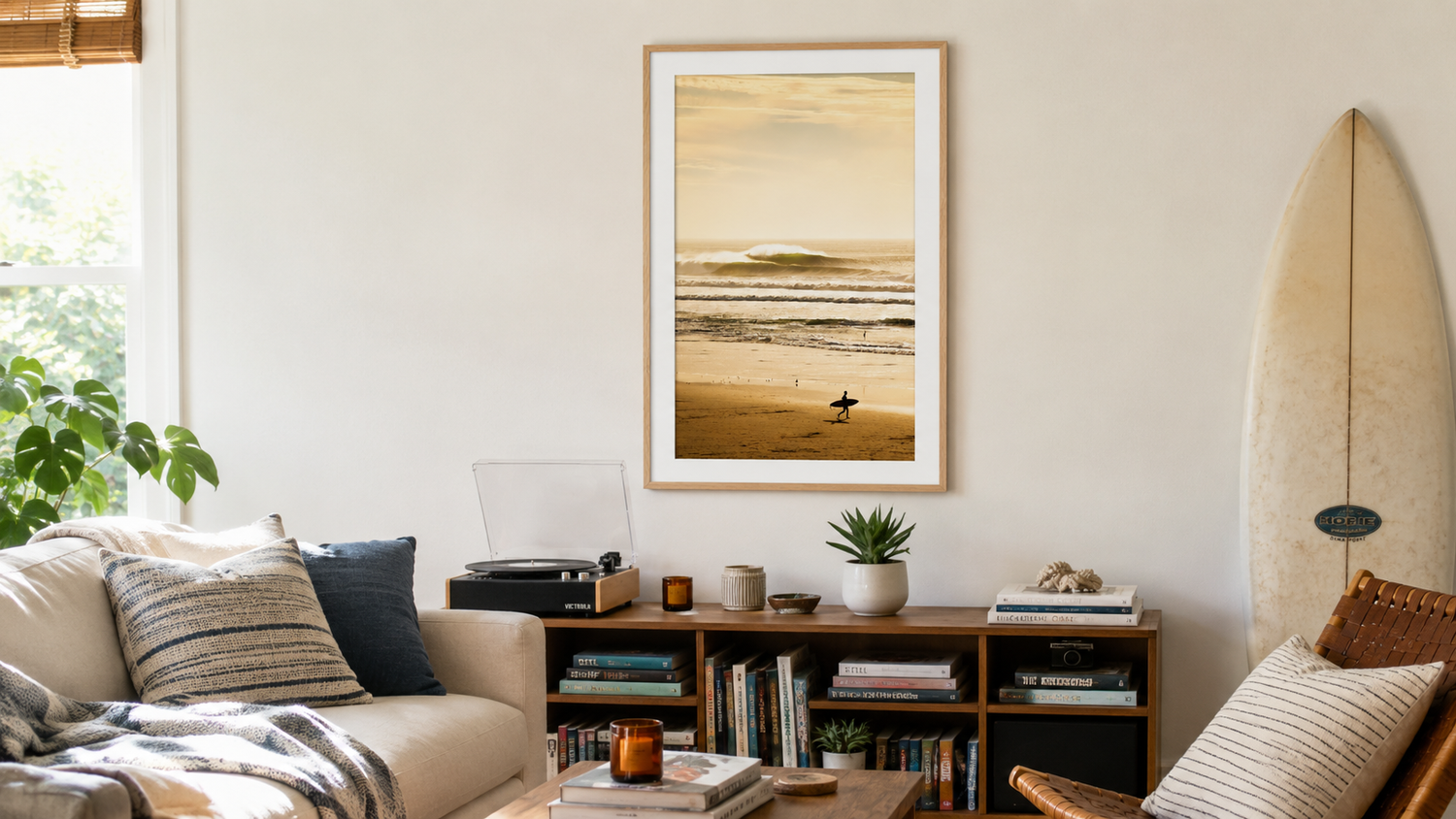
Pictured above: Surfers Paradise by Hunter Brians.
The single most common interior design mistake people make with coastal wall art is going too small. A 16×20 framed print floating above a 90-inch sofa looks like a postage stamp on a billboard. The room feels unfinished. The art feels apologetic.
Going large is the move. But "large" needs definition, and large coastal wall art has its own quirks — certain subjects work, others fall apart at scale. Here's the practical guide.
How to size large coastal wall art for a living room
The math is simpler than it looks. Two rules:
Rule 1: The 0.6-0.75 rule
Measure the width of whatever furniture sits below the art — usually a sofa, sometimes a console or sideboard. Multiply by 0.6 to 0.75. That's your minimum art width.
- 72-inch sofa → art should be 43-54 inches wide → a single 30×40 or 36×48 print
- 84-inch sofa → 50-63 inches wide → a 40×50 or 40×60 print
- 96-inch sectional → 58-72 inches wide → a 40×60 or larger, or a paired set
If your math says you need 50 inches and you're buying a 24×36 print (which is only 36 inches wide), you're going too small. That's the entire game.
Rule 2: 8-to-12 inches above the furniture
The bottom of the frame should sit 8 to 12 inches above the top of the sofa or console. Closer than 8 inches and it feels crowded; further than 12 inches and the art floats away from the room, disconnected. This is the single most common hanging mistake — people hang art too high because it's where the nail naturally goes at eye level.
For a living room arrangement, eye-level rules go out the window. The art relates to the furniture, not to where a standing person's eyes land.
What counts as "large" in living room terms
Sizing language varies between brands, so here's the practical translation:
- 24×36 — the minimum for "above sofa" art. Works in apartments and tighter rooms. Anything smaller reads as a vignette piece for a hallway or shelf.
- 30×40 — the sweet spot for most living rooms. Holds a wall, anchors a sofa, doesn't overpower a modestly-sized room.
- 36×48 or 40×60 — statement scale. Fills a wall, becomes the room's focal point, requires commitment.
- Anything 50+ inches on the long side — gallery-scale. Real impact, but the print needs to earn it (more on subject choice below).
Browse our coastal wall art collection filtered to 24×36 and up for living-room-ready sizes.
What coastal subjects actually work at large scale
Not every photograph belongs blown up to 40×60. Three things make a print work at large scale:
1. Simple compositions
Horizon lines. A single wave. An empty beach at dawn. The fewer elements in the frame, the more the size adds meaning rather than confusion. A complex shot with twelve surfers, a pier, three umbrellas, and a sailboat just becomes a busier mess when you make it bigger.
2. Strong tonal contrast
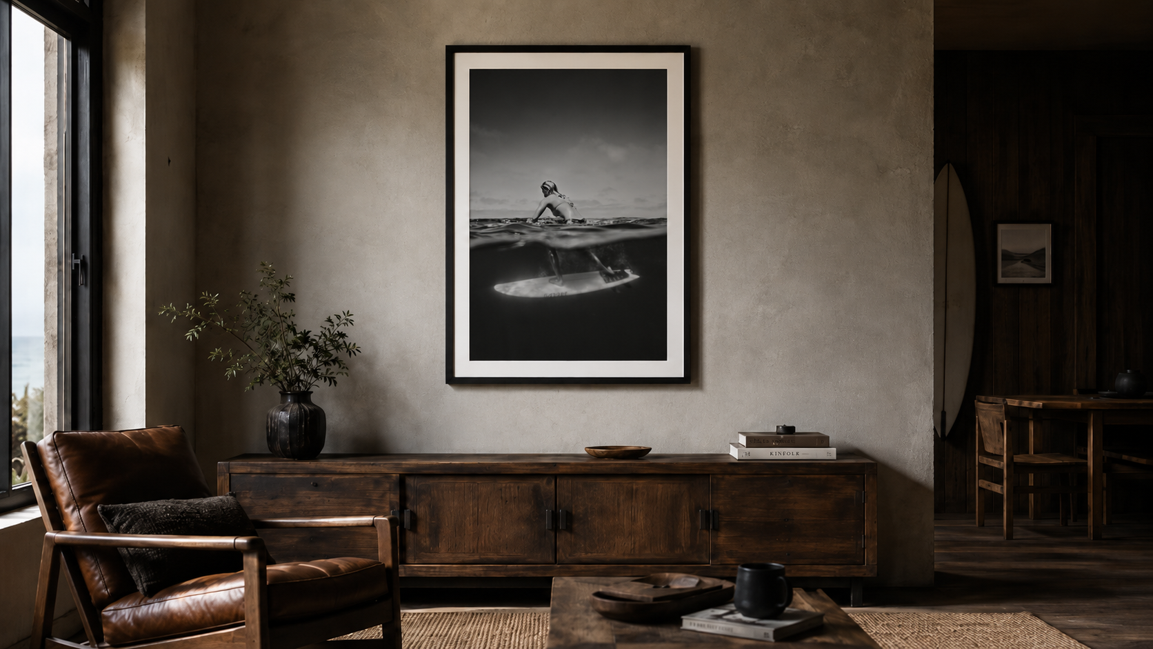
Large prints work hardest when they have something to anchor the eye — the dark of a wave against the lightness of foam, a black silhouette against a sunset, the contrast between water and sand. Flat, mid-tone images get muddy at scale. This is why dramatic surf and black-and-white photography tend to do especially well as oversized prints. See our black-and-white collection for examples.
3. Texture and detail that rewards a closer look
Great large coastal wall art works from across the room and from two feet away. The water has spray. The wave has structure. The surfer has gesture. From across the room it reads as a strong composition; up close it shows craft. Stock photography fails this test — it loses up close.
Subjects to think twice about at large scale
- Busy landscapes with lots of competing elements (boats, people, structures). Better as smaller pieces.
- Generic blue-sky-blue-water shots with no focal point. Becomes wall-colored noise at scale.
- Sunsets without something in the foreground — at 40×60 a flat sunset gradient just looks like a screensaver.
Frame choices at large scale
Frame mistakes get bigger when the art gets bigger.
- Black frames read graphic and modern. Best for black-and-white prints, contemporary spaces, gallery-feeling rooms.
- Natural wood frames read warm and Californian. Good for sun-drenched prints, lighter color palettes, modern coastal interiors with organic textures.
- White frames read clean and minimal. Best when the print needs to feel airy or when the walls themselves are darker.
One rule: don't mix frame styles within the same room. Pick one and commit. Mismatched frames at large scale make a room feel chaotic.
A 4-ply white mat with proper bevel adds breathing room around the image — almost always worth it on prints 30×40 and above. Skip the mat only if you specifically want a poster-like or edge-to-edge look.
The four mistakes that ruin large coastal wall art
- Going smaller "to be safe." Safe in art means timid. A 16×20 above a 90-inch sofa is the visual equivalent of mumbling.
- Hanging too high. 8-12 inches above the furniture, not 24. Bring it down.
- Cluttering around it. One large piece doesn't need flanking smaller pieces. Let it breathe.
- Buying a thin cheap frame. A great print in a bad frame loses 60% of its impact. Especially at large scale, where every flaw is amplified.
Where to start
Measure the wall behind your sofa. Multiply the sofa width by 0.65. Filter our coastal collection to sizes that match, or browse framed surf photography if you want something more dramatic. Pick one piece you'd hang in a museum, not five you'd hang in a beach rental.
One large, intentional print does more for a living room than any other piece of decor you can buy. Worth doing right.

Leave a comment
This site is protected by hCaptcha and the hCaptcha Privacy Policy and Terms of Service apply.