

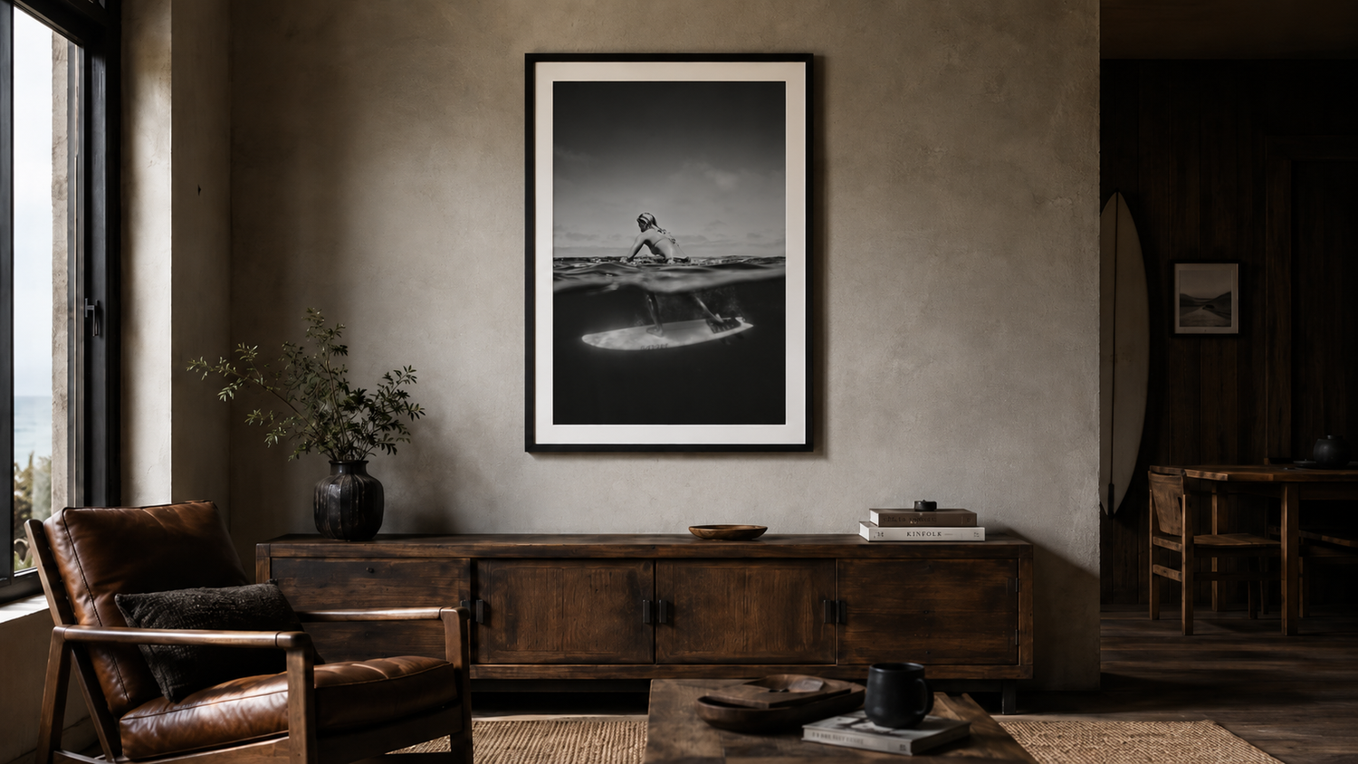
Pictured above: Internal Wave by Damon Loble.
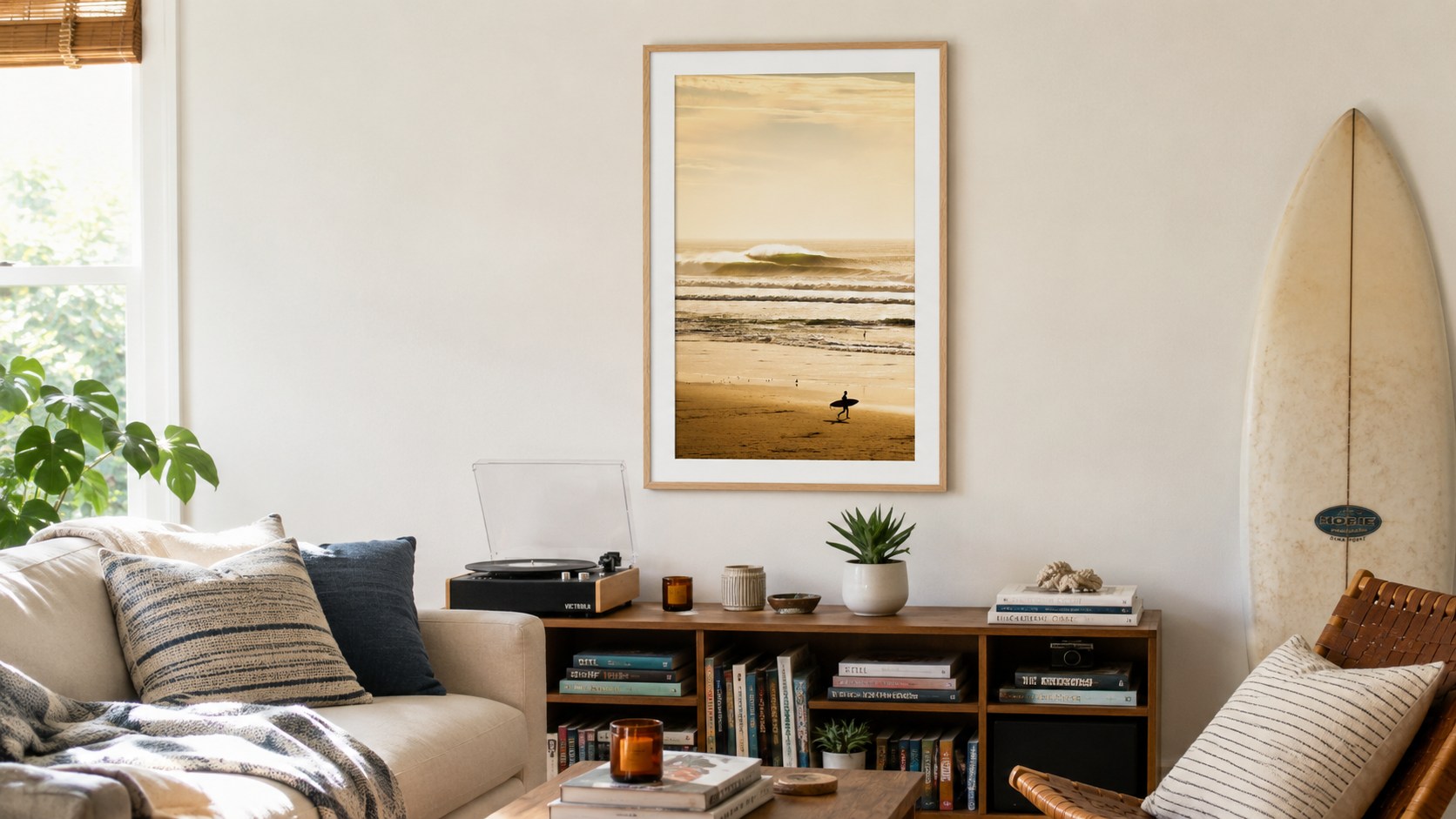
Color surf photography is great. It can also feel a little like a vacation postcard — bright blues, golden light, the whole "wish you were here" energy. That's not always the vibe you want hanging over your sofa.
Black and white surf photography is the elevated version. It strips out the tropical cliché and leaves you with the stuff that actually makes a great photograph: composition, contrast, gesture, and light. The result reads as fine art photography first, "coastal decor" second — which is exactly the point.
What black and white does that color doesn't
The shift is mostly about restraint. Color photography tells you what to feel ("look at this beautiful blue ocean!"). Black and white asks you to look harder. The wave becomes a shape. The surfer becomes a silhouette. The light becomes the actual subject.
Three specific things black and white changes about a surf photograph:
- It removes the "tropical" association. A bright color photo of palm trees and turquoise water reads as travel-magazine. The same scene in black and white reads as documentary.
- It emphasizes form over place. You stop thinking about where the photo was taken and start looking at the wave itself — its curl, its weight, the spray off the top.
- It plays better with most interiors. Color photography fights for attention with everything else in the room. Black and white sits inside almost any palette without competing.
Where black and white surf photography works best
Modern coastal interiors that want to feel grown-up
If your aesthetic leans toward neutral palettes, natural wood, linen, and a generally restrained design language, black and white surf photography fits without effort. It carries the coastal connection without leaning hard on it.
Masculine coastal homes, beach apartments, and bachelor pads
This is the lane most beach decor ignores. Beach houses get treated as inherently feminine — soft palettes, light wood, lots of white. Black and white surf photography is the easiest way to push the aesthetic in a more masculine direction without abandoning the coastal feel entirely. Dark frames, big formats, single statement pieces — that's the move.
Spaces that aren't traditionally "coastal" at all
Black and white surf prints work in city apartments, lofts, offices, and modern interiors that have nothing to do with the ocean. Because they read as fine art photography rather than beach decor, they belong in rooms where a colorful tropical shot would feel out of place.
Browse the Black & White collection for examples — every print here is shot specifically to hold up in black and white, not just desaturated from color.
What to look for in a great black and white surf print
Not every surf photo translates well to black and white. The good ones share a few qualities:
1. Strong tonal range
A great B&W print has both deep blacks and bright whites — true blacks in the water, true highlights in the spray and foam. Prints that live entirely in the middle grays look muddy on a wall. The contrast is what makes the print read from across the room.
2. Compositional clarity
Black and white reveals weak compositions because color isn't there to distract. A great B&W surf shot has a clear focal point — a single wave, a surfer mid-action, a glassy lip backlit by sun. Busy color shots become incoherent gray shots when stripped of color.
3. Gesture or motion
The best black-and-white surf photography has a sense of movement frozen mid-action — water spraying off a lip, a surfer carving, a wave just before it breaks. Still scenes (a flat horizon, an empty beach) can work but rarely as the hero anchor piece. Save those for hallway-scale art.
How to style black and white surf prints with the rest of your interior
The good news: B&W is forgiving. The room around it doesn't have to match a color story because there isn't one. A few quick guides:
- Wood tones — warm. Light oak, walnut, teak. Black and white photography against warm wood walls or furniture is a near-bulletproof combination. The contrast warms the print and the print sharpens the wood.
- Frame choice matters more than usual. Black frames with black and white prints read graphic and modern. Natural wood frames soften the contrast and feel more Californian. White frames feel gallery-clean. All work — pick the one that matches your room, not the print.
- Mat or no mat. A 4-ply white mat adds breathing room and reads more "fine art." Going frame-to-edge (no mat) reads more contemporary and graphic. For larger sizes, a mat almost always wins.
- Don't add color "accents." If you're committing to black and white wall art, let it be black and white. Don't surround it with a turquoise throw pillow and call it "coastal." The discipline is the design.
Where it works in a home
- Over the sofa: the classic anchor placement. Single large B&W surf print, 30×40 or bigger. Done.
- Bedroom over the bed: moody, atmospheric, easier to sleep under than something bright and color-saturated.
- Office or workspace: conveys "this person has taste" without screaming about it.
- Hallway or stairwell: a series of 3-4 smaller B&W surf prints reads like a curated personal gallery rather than decoration.
- Bathroom: high-contrast B&W photography handles steam better than colorful prints and reads as deliberate rather than safe.
The whole point
Black and white surf photography is what happens when you want a coastal interior that takes the ocean seriously. Less "I went to Hawaii." More "I think about the ocean as a real thing." The art reads as something the homeowner chose, not something a designer threw on the wall to fill space.
If that's the direction your home is going, start in the Black & White collection, browse our framed surf photography for full-color companions when you want them, or see the coastal wall art catalog for everything else.
Leave a comment
This site is protected by hCaptcha and the hCaptcha Privacy Policy and Terms of Service apply.